major-studio-1
Part 2: Prototype 2
Feedback from 09/04
From the last session, we asked for feedback in the following areas:
- Form: how could we communicate that our box is harmless and interactable?
- Interactions: how do we encourage greater interactions, i.e. more touching, longer look, curiosity etc?
After presentation, we received some useful feedback: For both these questions, the answer of “affordance” proved to be key. A classmate suggested that from visual inspection, affordances could be gleaned, and if interesting enough, may be explored further: she suggested a slot or receptacle of some sort that made it clear what our object did. Some other classmate suggested a physical mailbox with flag since we are also interested in tangible notes.
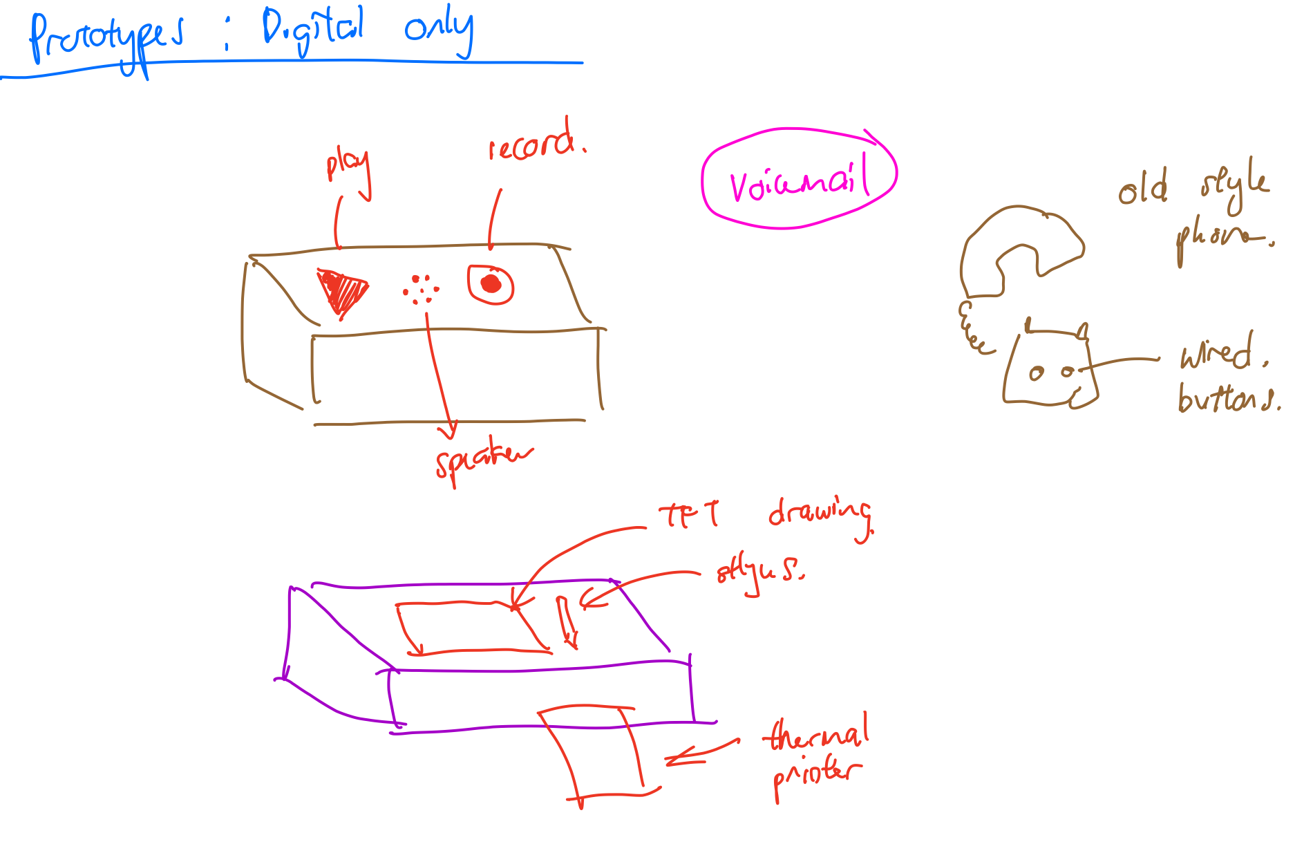
Harpreet suggested that our form did not suggest enough affordance, and to be wary of false positives. For example, a retro phone shape would elicit suggested interactions of picking up and listening: there is historical and cultural precedent for people to understand what it does and how they are expected to interact. For the latter, just because a passerby would touch something did not mean they did so with our intended range of intentions.
Clarifying Purpose and Interactions
It is clear that we needed to be more focused, deliberate and explicit with our intentions, expressing it as affordances. Upon further discussion, we explored how we could combine both our messages, to see how we could raise environmental issues while connecting people.
We posited that human connection could make us more connected with the issues of the community at large, and allow us to reflect on how our actions could impact each other. Cherry Hill Park could provide an opportunity for visitors all over the world to connect with nature and man-made environments, a more Romantic setting to reflect in.
This may not be obvious, though, and we wondered how we could bring this issue to the forefront. We took inspiration from connecting animations and concepts: Sesame Street’s Pinball Count video, marble kinectic structures built from trash, modern day tech like bluetooth and wifi. We wanted to combine visual intrigue with hands-on functionality.
Researching Feasibility
However,some questions remained unanswered. For example, the gap that exists between ideation and execution: feasibility. There are constraints in that no power sockets were present, and no public wifi is within range. We also considered that with a vast majority of visitors to the area being tourists, they have limited trash on them, and may not have data services on their phone. As such, phone based tech like QR codes, app installations or web-based experiences may not be feasible.
Over the weekend, taking these constraints in mind, I headed down to an electronics shop to see what components may be viable. Bluetooth, voice recorder and touch LCD may be viable, which were then purchased. However, while testing these out back home, I discovered that it would take some time incorporating these into a form. For example, I did not have a phone-like piece on hand, and the buttons on the voice module were tiny and too technical-looking to be exposed to the public. Connecting to bluetooth would not be a problem, but getting users to send and receive media would require a dedicated app/interface which would not be possible without web connection.
Expanding on Concepts
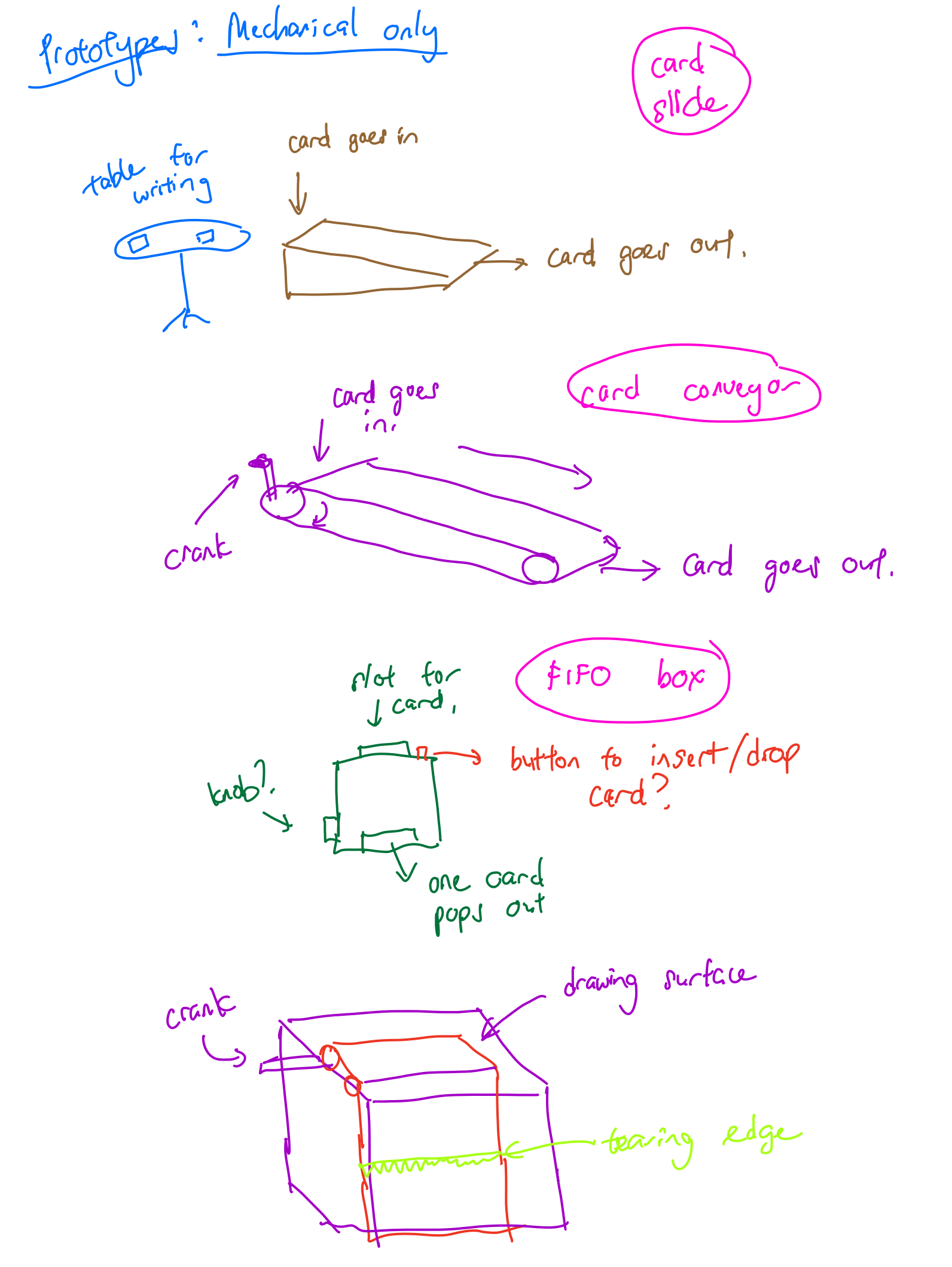
With the concepts clarified, I sketched some ideas, paying closer intention to the constraints and considering other modes. In particular I considered the written note passing, and thought about how a user would be getting a message different from his/her own, i.e. FIFO box. I considered mechanisms such as a conveyor belt or a slide to transport messages, and a conveyor belt of canvas to refresh the drawing area.
Constructing Prototype 2
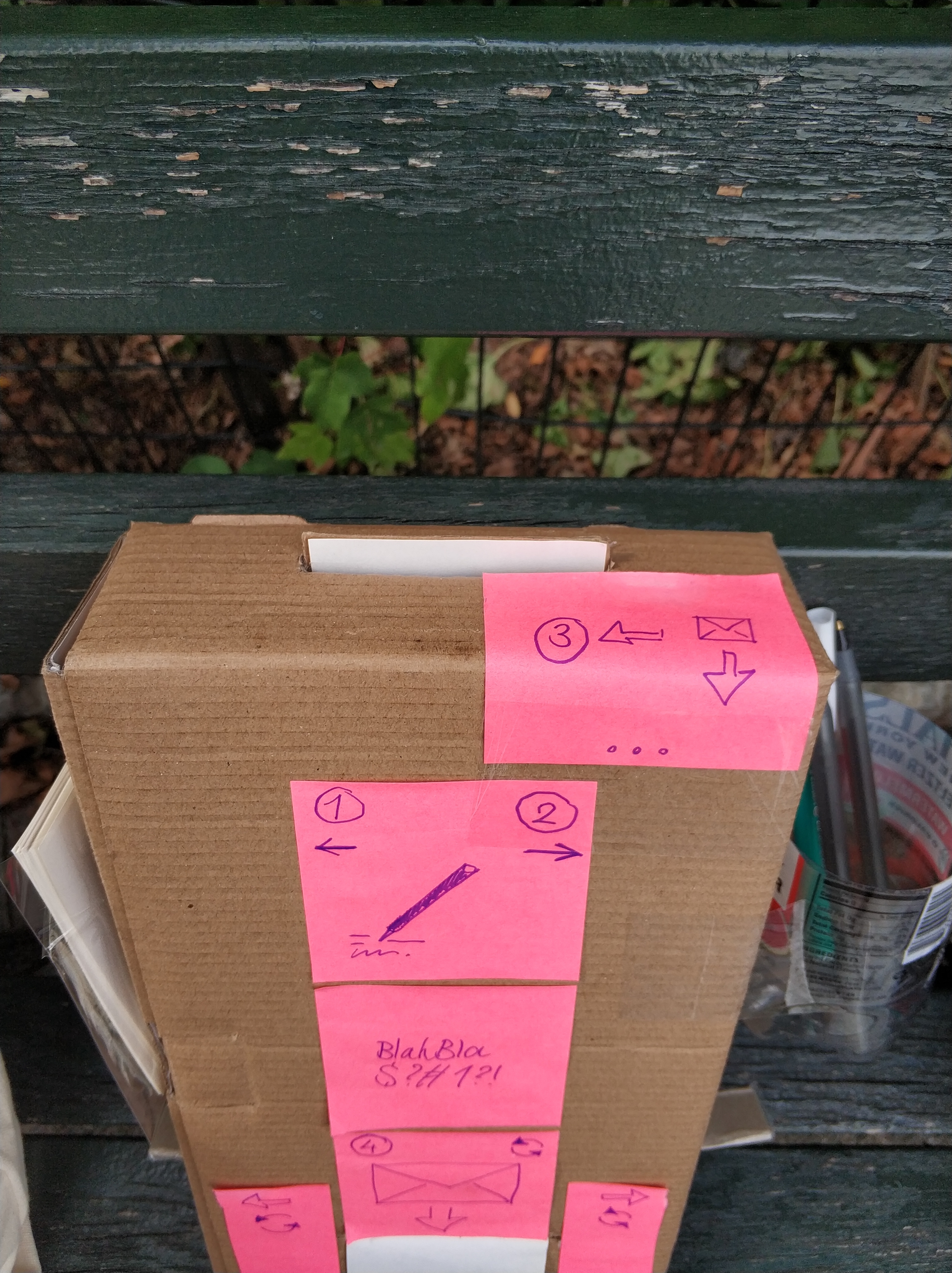
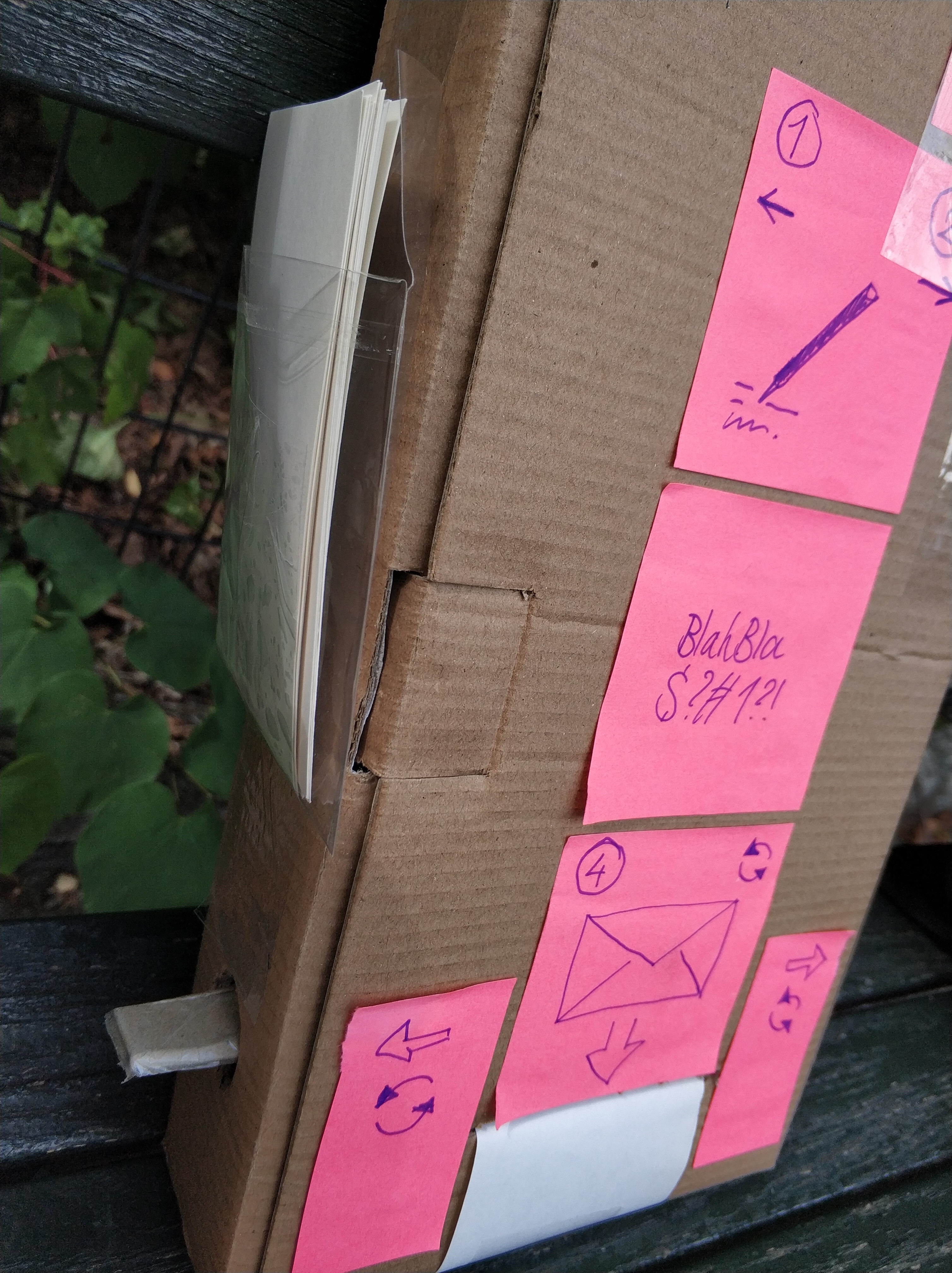
Working on the initial concept, I built as simple a FIFO box as I could think of, using a simple wheel with rubber bands for friction, to grip the cards and direct it to the opening. Patricia added the visual cues, and attached a pocket to hold the deck of blank cards, and a pen holder.
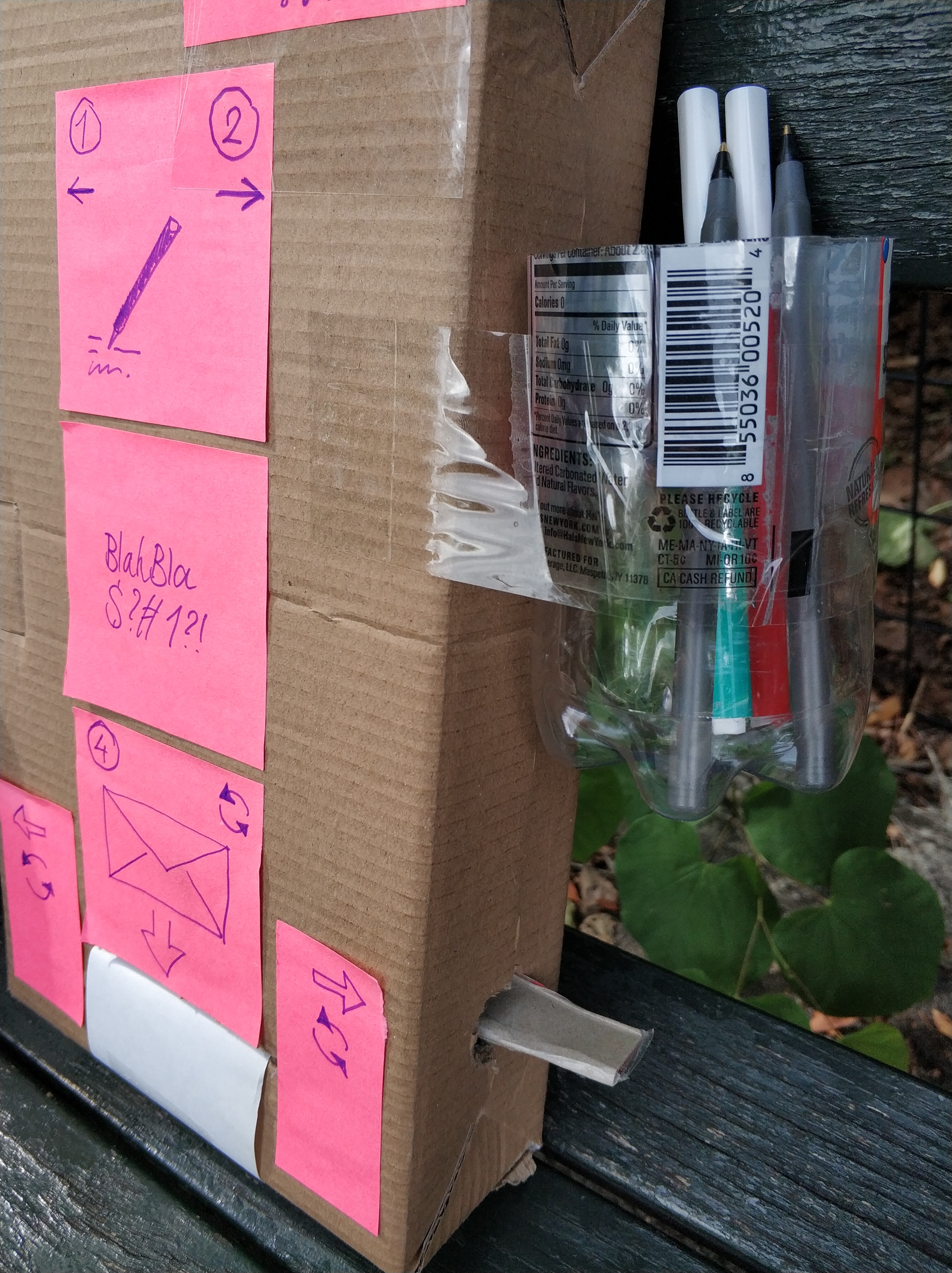
Results at Location 1
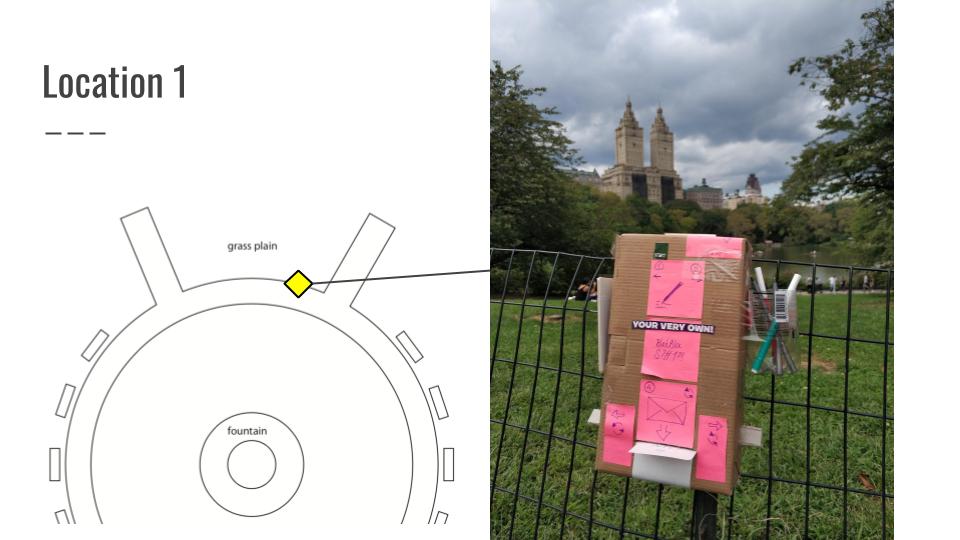
Location 1 was the popular tourist photo spot, overlooking the castle and lake. We noticed that it was frequently used by rickshaw drivers to direct tourists for photos.
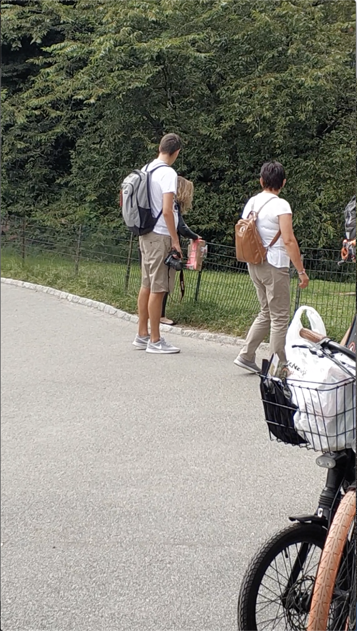
The situation would play out over and over again over the course of 60 minutes: rickshaw driver would direct group of tourists to the spot, notice our box, and comment, leading to tourists inspecting it as well. Their gaze would linger for about 5-10 seconds, before they stand in front of the the box, blocking it, to take a photo with the castle as the backdrop.
After about 40 minutes, we decided to see if passersby were confused due to lack of instructions, hence resulting in lack of interaction. Patricia added an arrow, but the results were the same. After about 10 more minutes, she modelled interactions with the box, and that attracted the attention of one tourist in particular, who observed her for about 10-15 seconds. This did not result in interaction on his part.
Results at Location 2
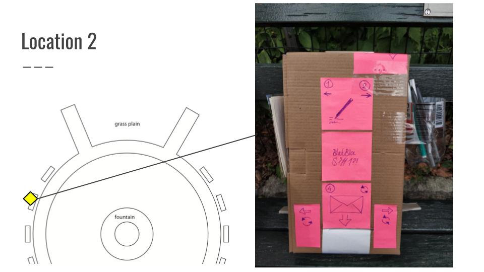
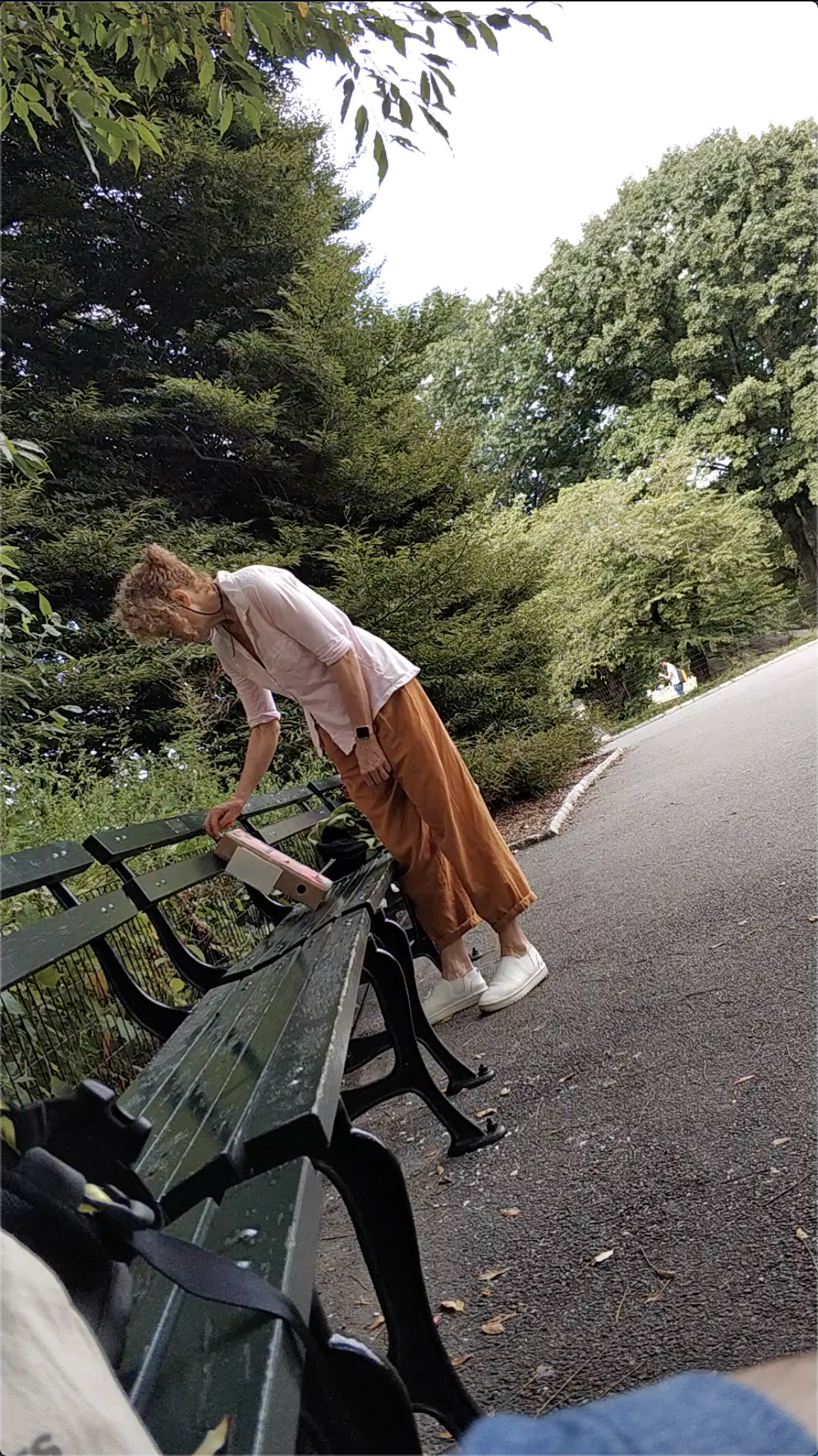
Location 2 was at one of the benches on the perimeter of the turnaround. This stretch of benches was generally shady, and heavily utilized by park visitors on foot.
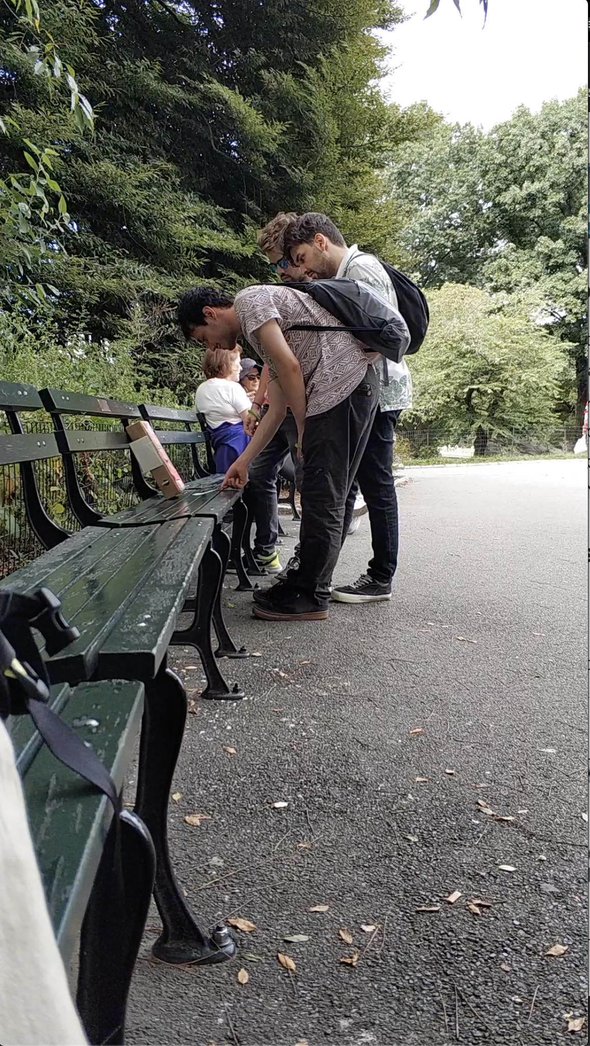
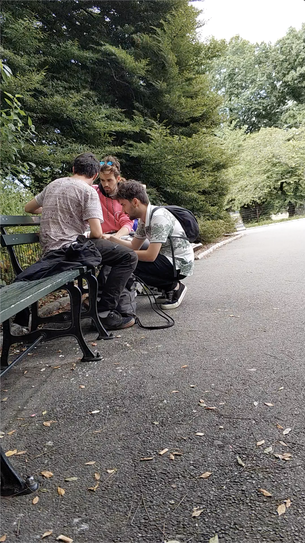
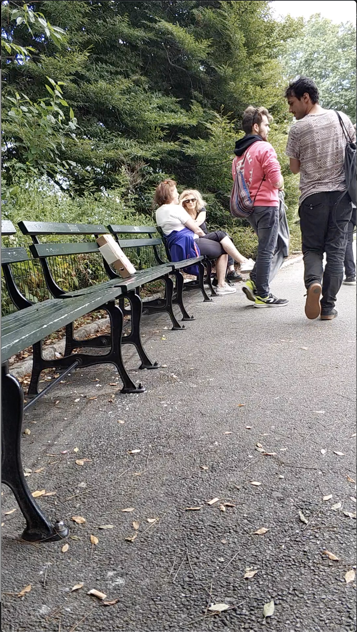
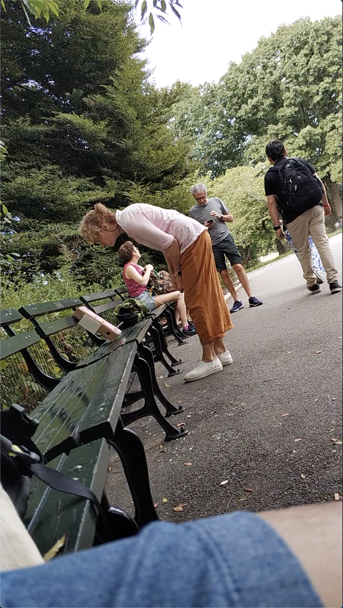
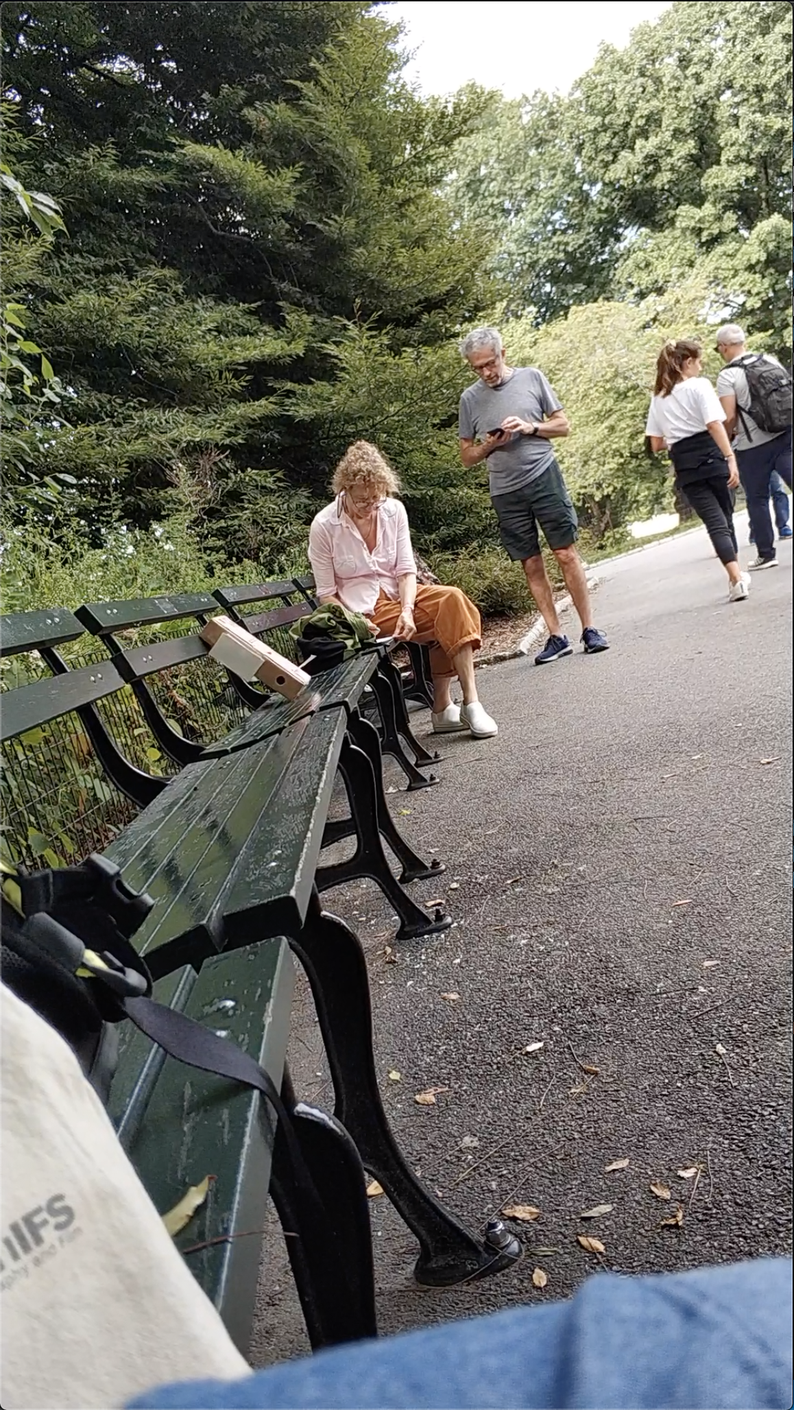
The box attracted attention, especially in contrast to the dark benches. Within a 20 minute duration, at least 4 groups approached the box, inspected the box and interacted in the manner which we hoped (write a message and drop it in).
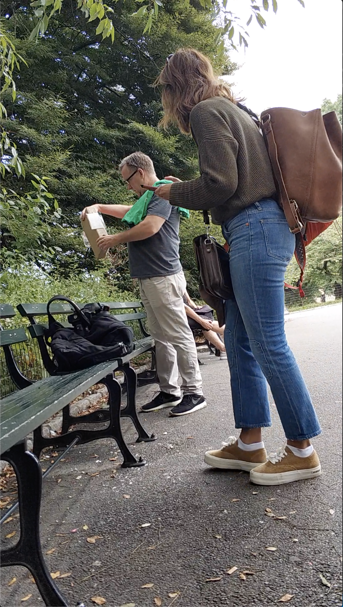
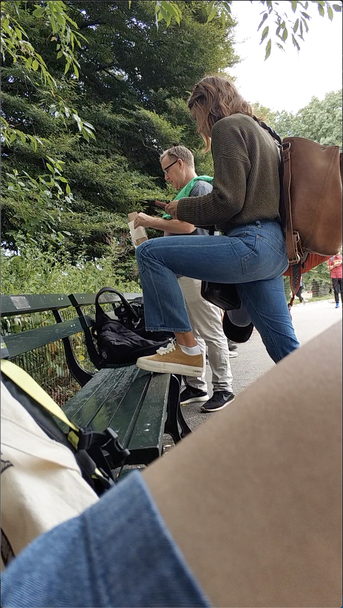
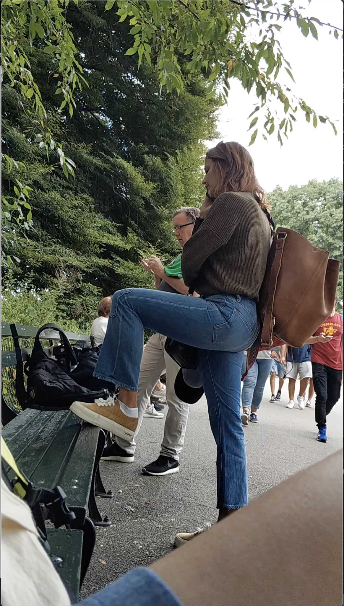
However, one of the users removed the axle, which looked like a tab, possibly pulling it out. As such, users were only able to put messages in, but could not pull messages out.
Feedback from Prototyping
Due to the presence of several features (I dare not call them affordances), the box gave the users suggestions on how it could be interacted with. Notes and pens suggested a writing component, and the slots suggested that things could be inserted/removed. Observing how users explored these features were useful to understand what stood out, what sequence of exploration, if any, exists, and what users would push or pull as part of the exploration process. The fact that they continued to investigate the box even when there was a lack of interactable parts (after the removal of the axle), suggests they guessed what the slots represented, and put stuff in anyway.
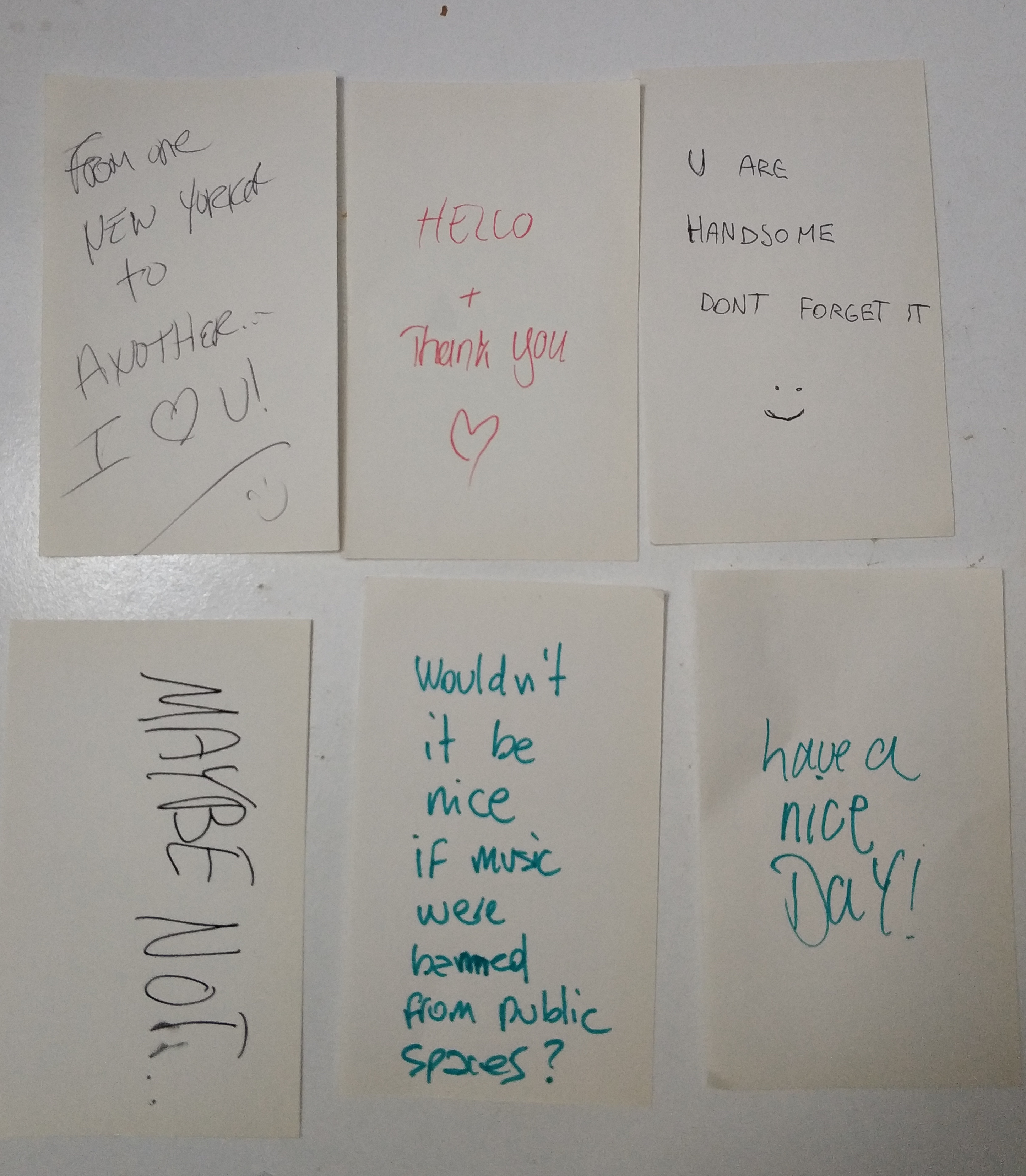
The content/messages in the cards varied. While it wasn’t our intention to restrict the content of the messages this time around, it was nonetheless interesting to see how users understood the purpose of this intuitively. From observations, this was determined by the message they pull out of the box.
We learnt quite a bit from observing people at locations. While the tourist photo spot had a constant stream of traffic, people were preoccupied with their planned task (taking a good photo), and everything else was potentially an obstacle. At the benches, the shady environment and the tools to take a break may have pushed the interactions in our favor.
Feedback and suggestions from class presentation
Instructions were agreed to be too complicated, involving too many actions and steps. What if only one or two steps were all that is required? Could some actions be removed altogether?
The prototypes we have been working with needs to be no longer paper prototypes. This may improve interaction and helping us achieve interaction goals.
Some classmates with industrial design background suggested making it in one color. Someone suggested a retractable roll of receipt paper; another suggested keeping the mechanism simple, like one that operates using gravity, like a paddle.
I think it is a more challenging task to visually suggest that the messages are meant to be for environmental conservation purposes, as opposed to a regular message dropbox. It was suggested that the form could help in this regard.